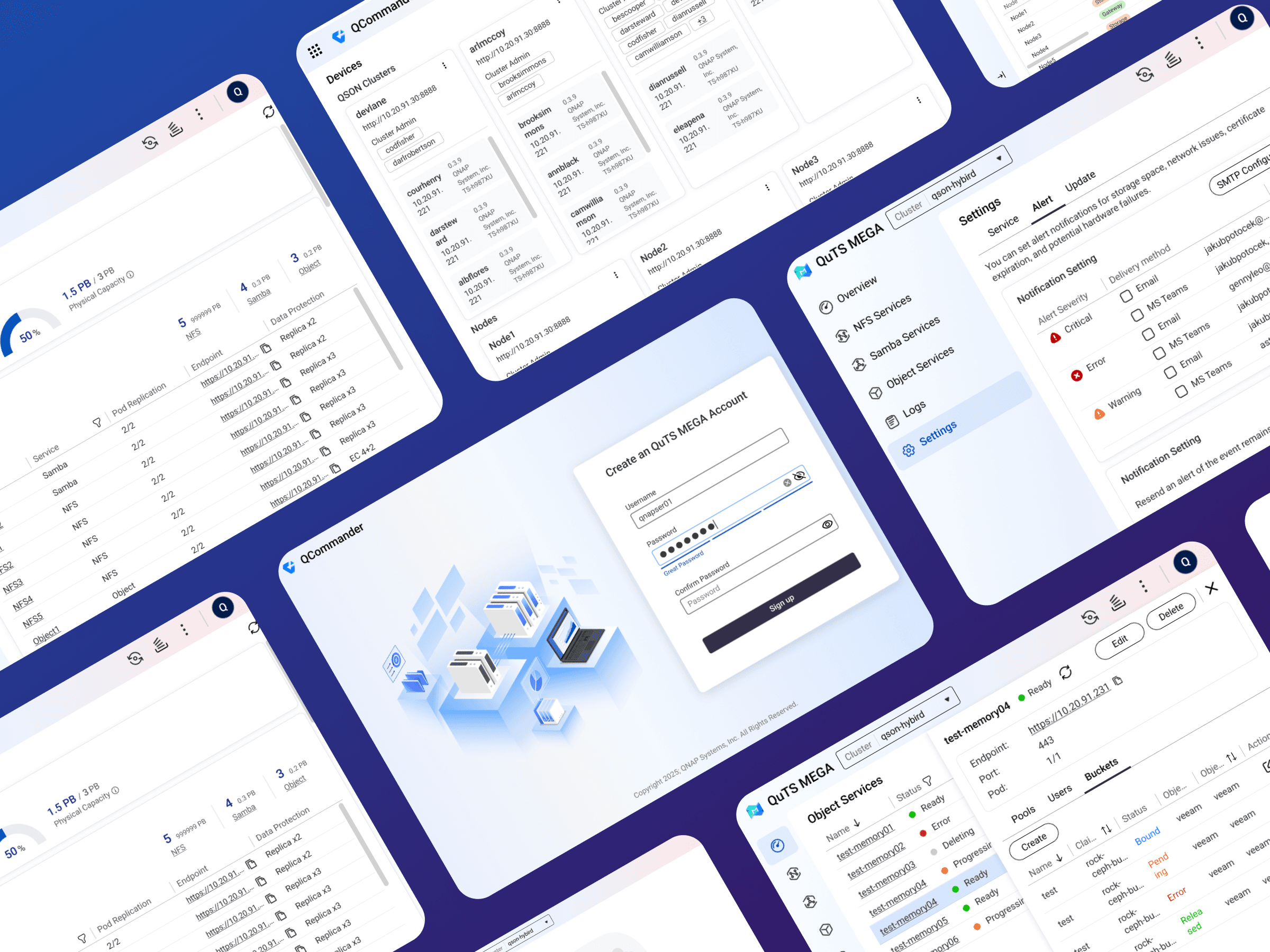
Web App UI
Enterprice Software
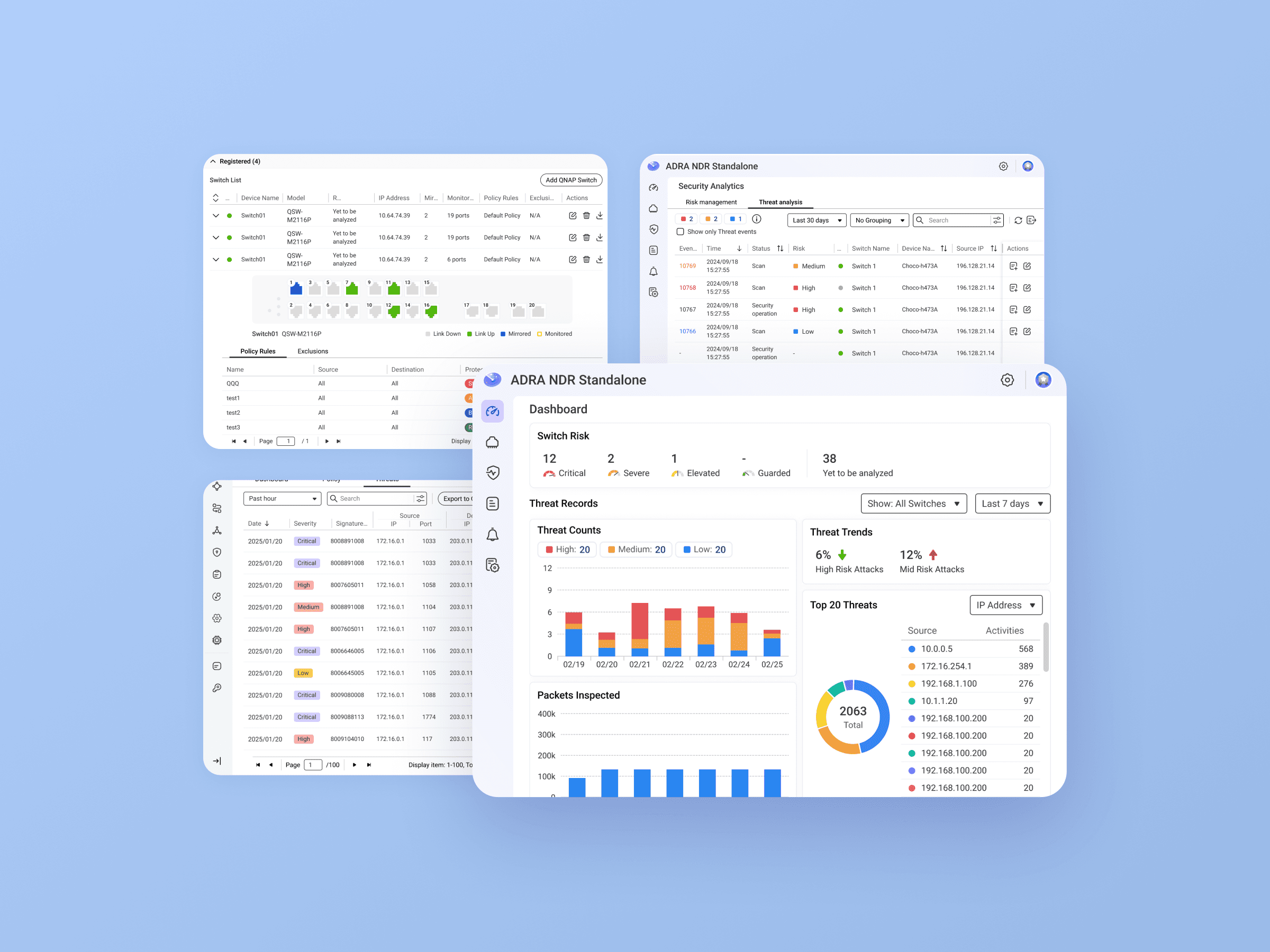
Designed a clear and consistent interface for large-scale NAS environments, simplifying complex configurations and establishing a cohesive design system across platforms.
Background
QuTS Mega and QCommander are NAS cluster management tools designed for large-scale enterprise environments.
They enable scalable storage and backup solutions by supporting expansion across multiple NAS devices, allowing businesses to flexibly adjust storage and computing resources according to needs such as service launches or promotional peaks on e-commerce platforms.

Goal
Design a new interface that serves two distinct user groups:
Service provider backend administrators (QNAP): Manage clusters and NAS devices on behalf of clients, with higher-level access permissions.
Enterprise IT administrators: Monitor system health, performance, and storage usage of NAS devices.

Role & Responsibilities
As the sole UI designer on the project, I collaborated closely with the product manager and front-end developers.
The PM was responsible for defining product requirements, while I took charge of user flow design, interface visuals, and building the cross-platform design system.
My key responsibilities included:
Understanding user needs and task flows
Designing core interfaces and interactive behaviors
Creating a reusable component library and scalable design system
Challenges & Approach
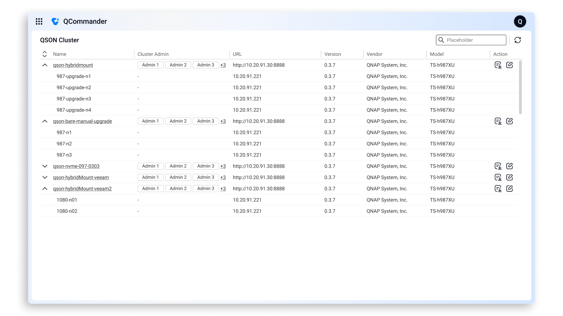
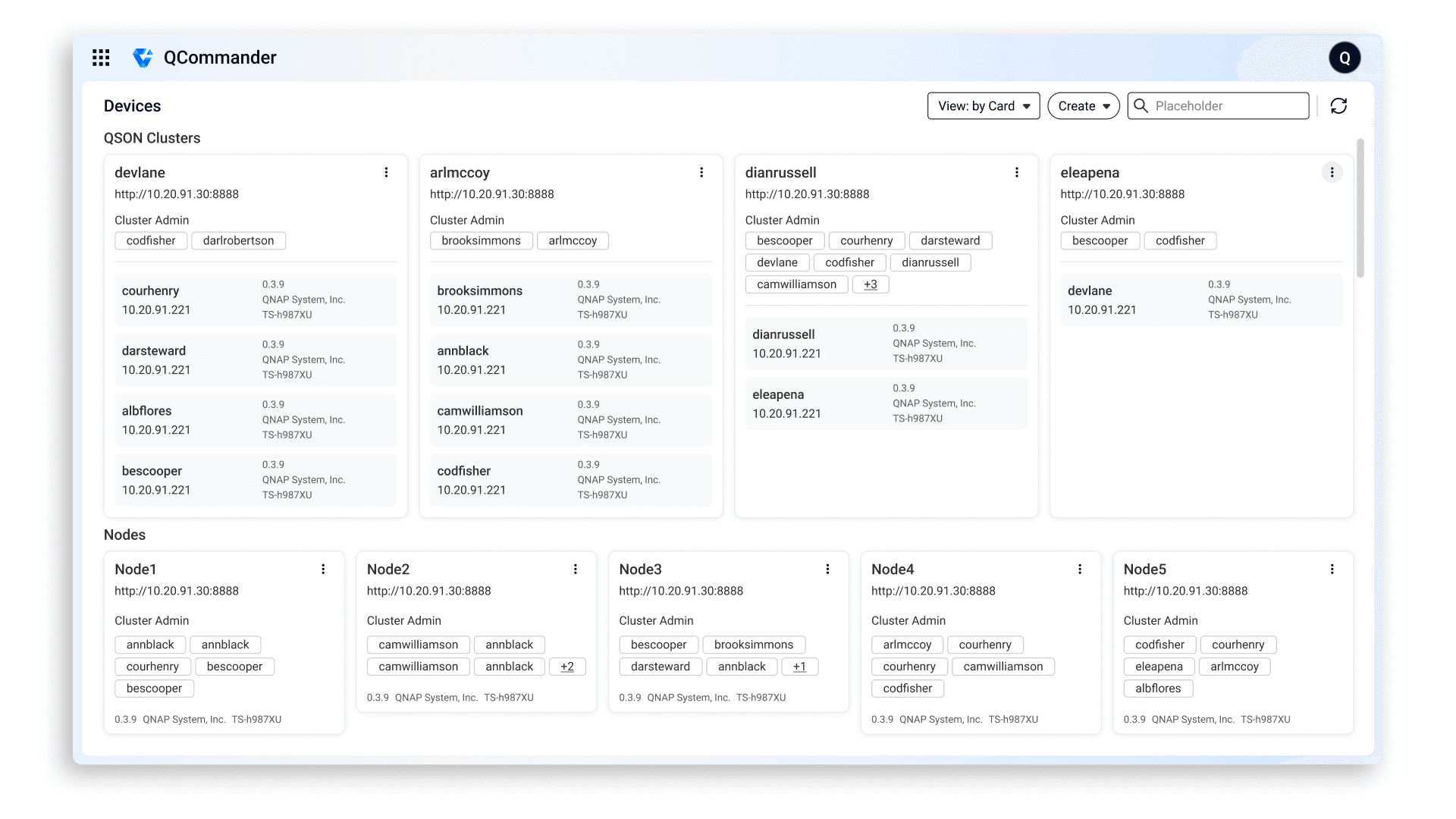
The main challenges users faced were information overload and an inconsistent interface across different pages.
Challenge 1
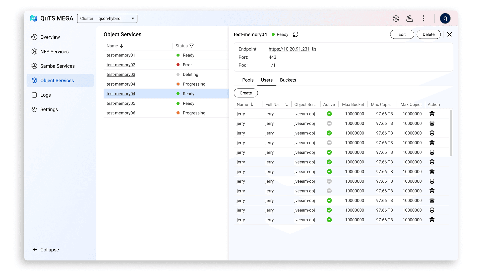
The Dashboard became difficult to read when there were too many devices displayed.
Approach: Introduced a card view mode to help users quickly locate and review specific devices at a glance.
Challenge 2
A large number of device statuses needed to be shown simultaneously.
Approach: Defined a clear severity hierarchy (Safe → Critical) and applied distinct visual styles based on severity levels to organize information more clearly.


Challenge 3
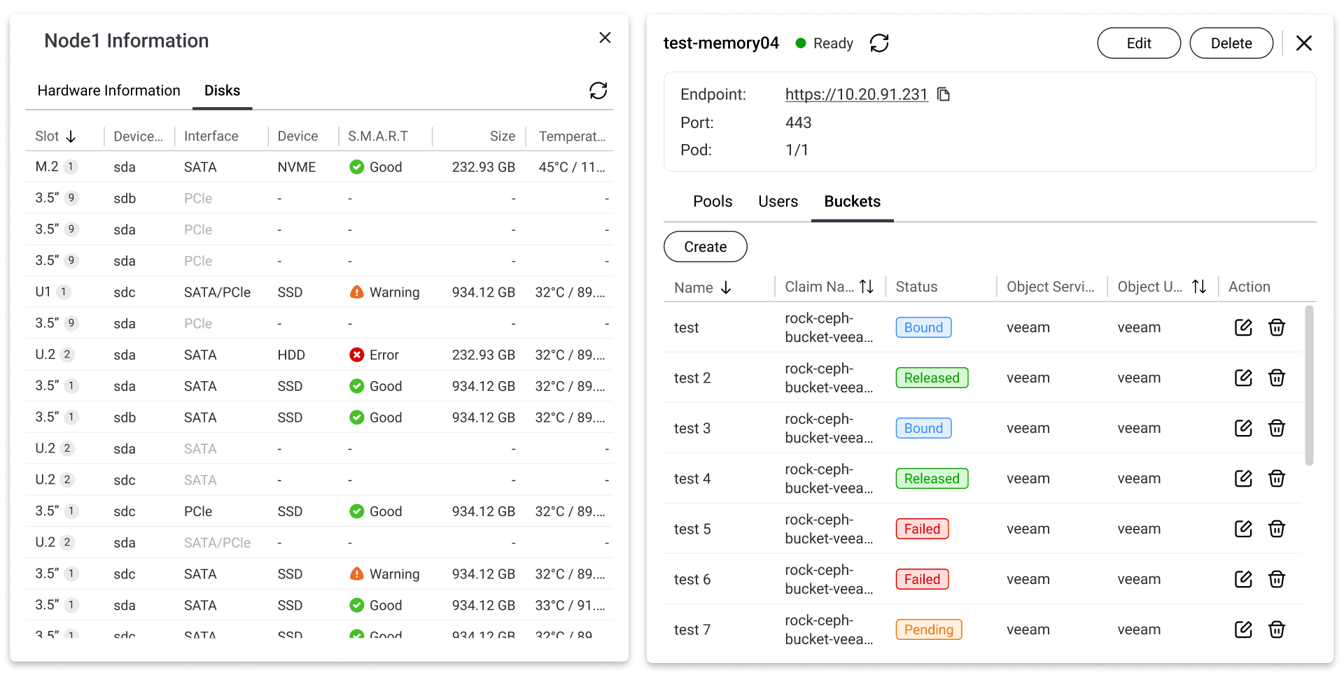
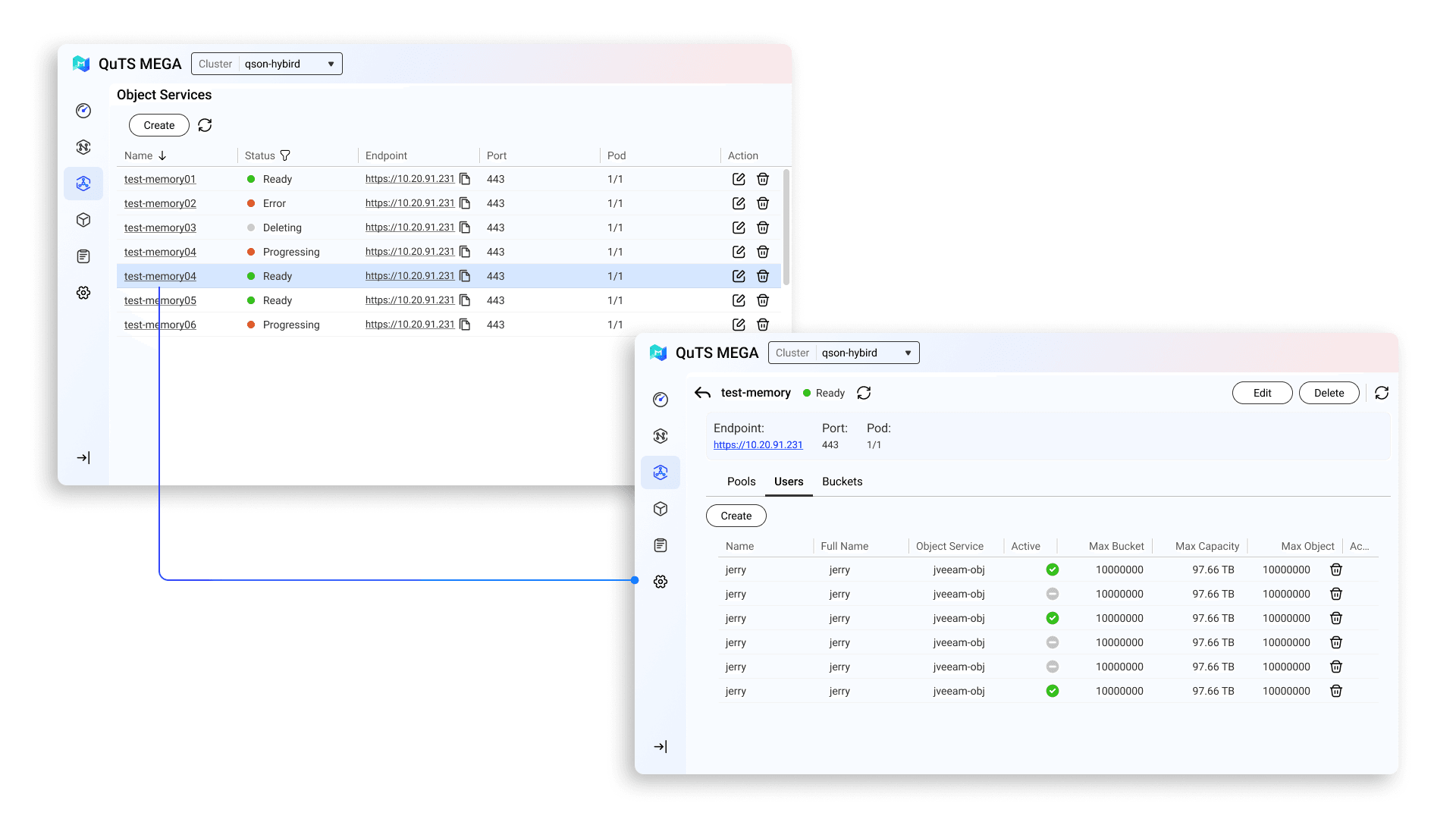
Users had to frequently switch pages when skimming through different cluster details, causing workflow interruptions.
Approach: Implemented an overlay window design, allowing users to view sub-information without leaving the main page, reducing clicks and improving navigation flow.
Outcome & Impact
The project was successfully delivered under a tight development schedule, completing UI design and front-end development that was originally planned for three months.
Through this project, I learned the importance of closely validating motion feasibility with front-end engineers early in the design phase.
I also realized that in large-scale management tools, defining a clear information hierarchy is critical for usability.
For future projects, I plan to map out motion design details earlier and collaborate with engineers using prototype testing to ensure smoother implementation.


🪴 2025 • By Astrid ;>