
Background
In 2024, the company launched a full visual redesign of its app store, established by the previous design team and rolled out progressively through 2024–2025.
Post-launch user feedback surfaced two recurring complaints: information density had dropped significantly (from 24 visible apps to 9 on a 1440px screen), and the action button system was confusing to parse.
The whitespace causing the density issue wasn't accidental, it had been designed to accommodate download/update progress indicators.

Diagnosis: What the Audit Revealed
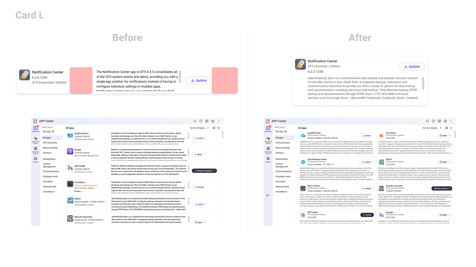
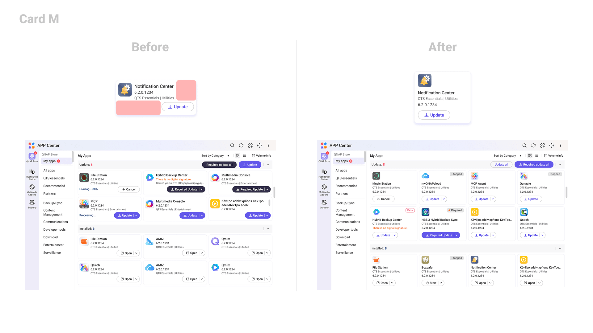
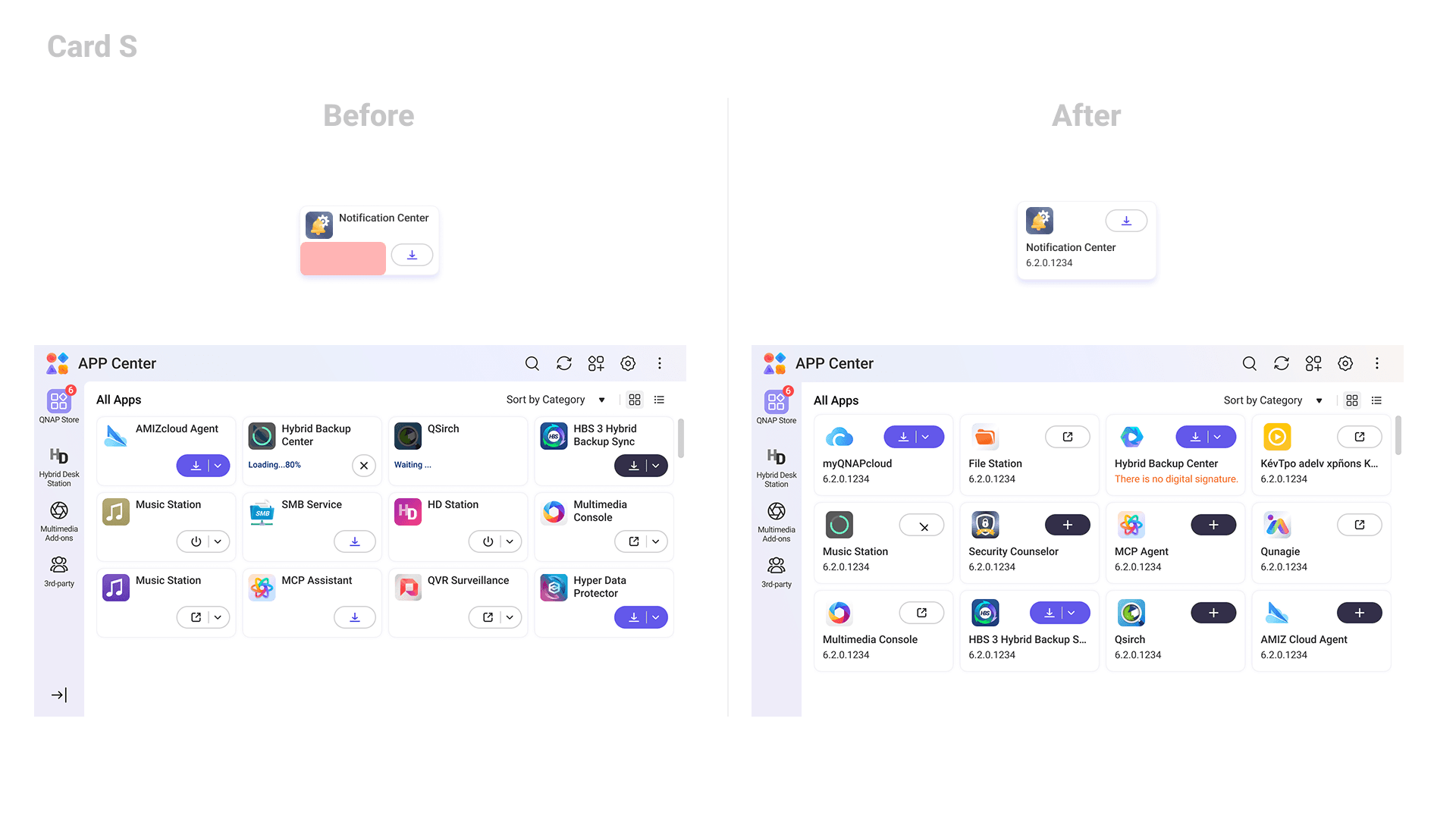
Before proposing solutions, I mapped every card variant across two dimensions: size (S, M, L) and state.
Space: Much of the vertical space in each card was reserved for download and update progress indicators. In practice, those states appear less than 10% of the time — meaning the reserved space sits empty in the vast majority of browsing sessions.
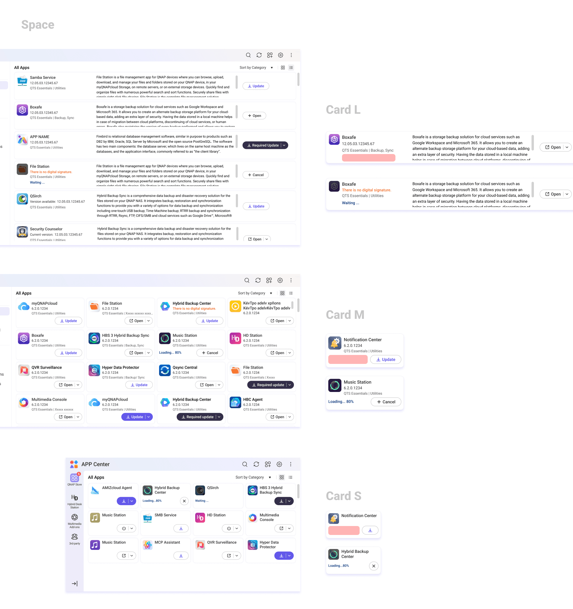
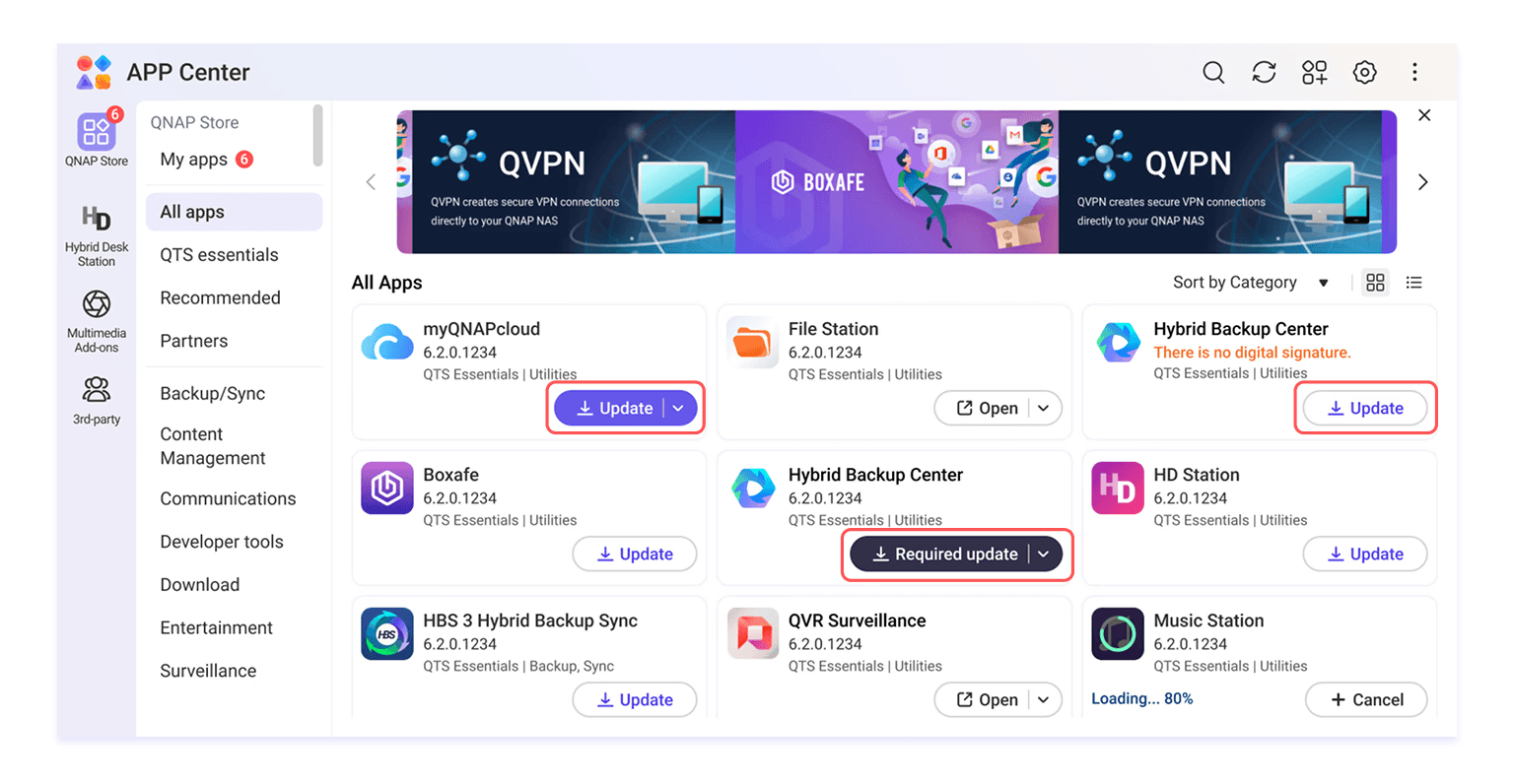
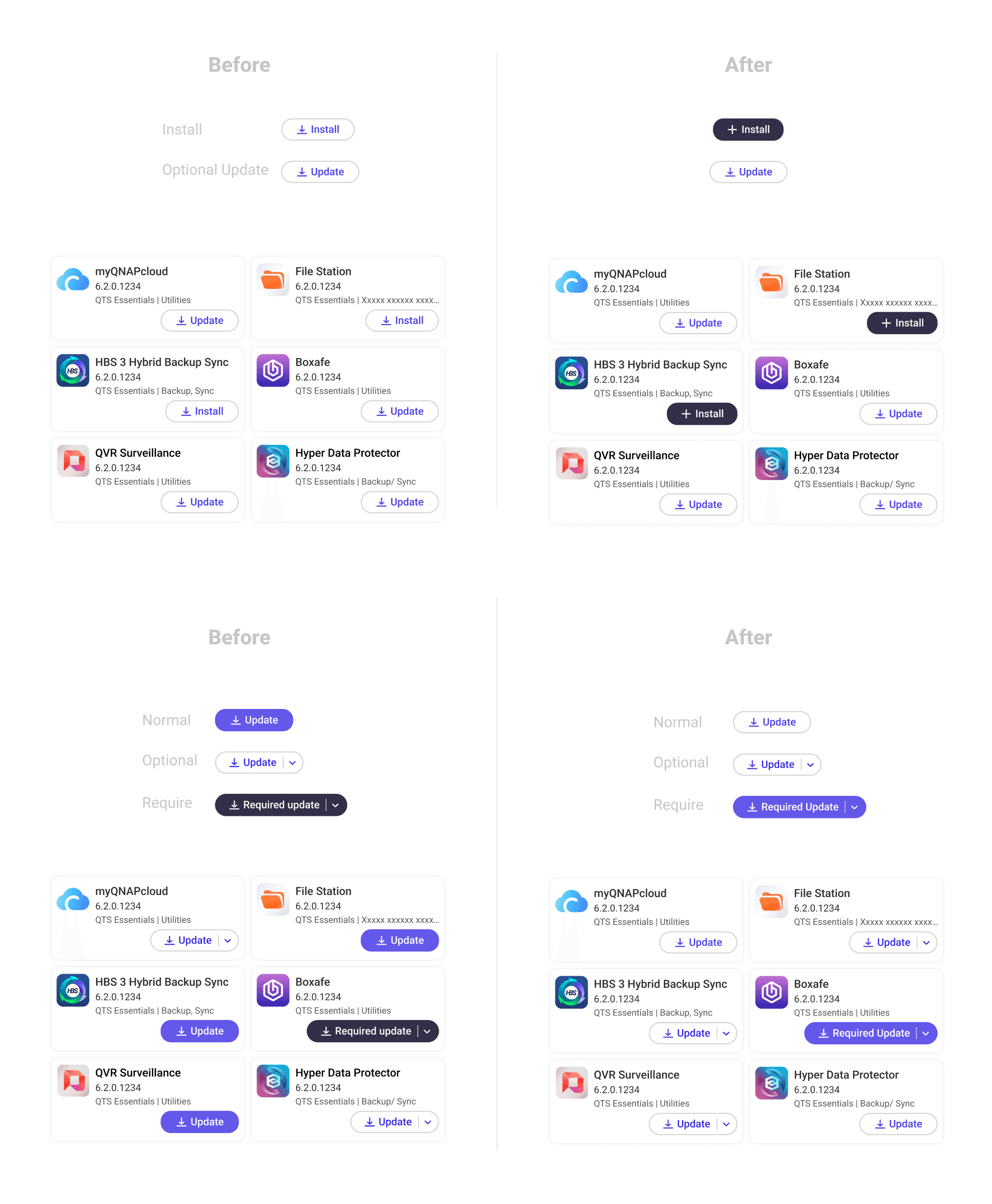
Button states: The existing system had eight distinct states (uninstalled, purchase required, standard update, optional update, critical update, installing, active, cancel) but the visual styles didn't reflect any logical grouping. Uninstalled and purchase-required looked completely different despite sharing the same intent. Uninstalled and standard update shared the same style despite meaning entirely different things. Users had no visual grammar to read the interface with.
Design Decisions
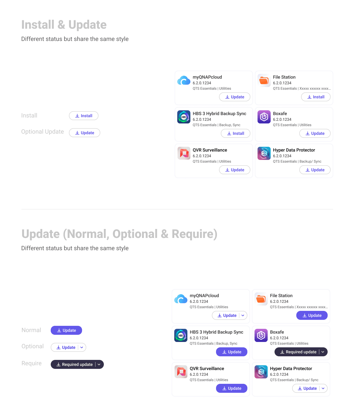
On space: A/B testing showed that an in-icon loading bar alone gave users sufficient feedback on download and update progress — the redundant text indicator below wasn't adding clarity. Removing it recovered significant vertical space without touching any other part of the card structure.
On button states: I reorganised the eight states into three semantic groups, each with a consistent visual treatment:
Install (uninstalled, purchase required) → solid black button
Update (standard, optional, critical) → purple; outline for non-urgent, filled for critical
In-progress actions (installing, cancelling) → separate pattern reflecting the transient nature of the state
The logic: visual style should tell users what kind of action they're looking at before they read the label.
Challenges & Approach
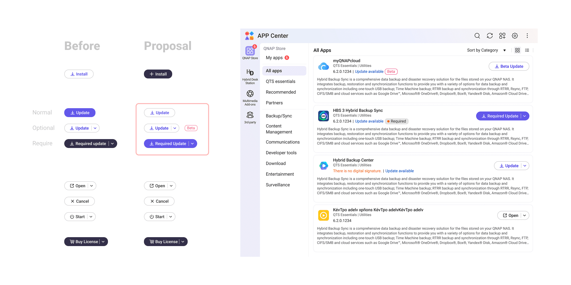
One proposed solution didn't survive testing. To distinguish optional updates (e.g. beta versions) from standard ones, I initially used a tag label. User testing revealed an unintended reading: participants interpreted the beta tag as the entire app being in beta, not just the incoming update version.
I proposed an alternative — a small indicator on the button itself — to carry that distinction without the ambiguity. After reviewing it with the PM, we agreed the edge case was rare enough and the UX gain marginal enough that the engineering cost wasn't justified. The feature was deprioritised.
Knowing when a finding warrants a fix — and when it doesn't — was as much a part of this project as the design itself.
Results
Layout improvements (L, M, S cards)
L cards went from displaying 6 to 8 apps per screen — a 33% increase in visible content. A/B testing also confirmed that users found the supporting description text easier to read in the new layout.
M cards showed no increase in card count, but the layout reorganisation produced a 26% improvement in user satisfaction scores — demonstrating that readability gains matter independently of density.
S cards traded a small amount of vertical space for meaningfully wider app name display, eliminating truncation and line breaks in the most frequently read element of the card.
Button redesign
Consolidating eight visual styles into three semantically consistent groups improved user scan efficiency by 60%.
The new visual grammar — purple outline for optional updates, purple filled for critical updates, black filled for uninstalled — gave users a reliable at-a-glance reading of app status without relying solely on label text.
Impact
A month after the PM and engineering team signed off on the full solution, the team revisited scope. The layout and spacing improvements required more engineering effort than anticipated — RWD adjustments and information architecture changes made the spatial work costly relative to the density gains it delivered. The decision was made to ship only the button style redesign.
The partial rollout still moved the needle: the button changes alone lifted overall user satisfaction by 22%.
Personal Learnings
Dig beneath the brief, not just into it.
The original ask was straightforward: show more cards on screen. But before jumping to solutions, I spoke directly with the colleagues who had flagged the issue. That conversation uncovered a second problem hiding underneath — the interface wasn't just dense, it was hard to read. That insight led to the button redesign, which turned out to be the change that actually shipped and drove a 22% satisfaction improvement. The most impactful solution in this project came from questioning the brief, not executing it.
Bring engineering in before the designs are done.
The card spacing improvements were ultimately deprioritised — not because the design was wrong, but because the engineering cost wasn't justified at that moment. The team had just completed a major database overhaul for the new design system and was carrying a heavy roadmap. That context existed from the start; I just didn't surface it early enough. I spent significant time testing and refining a spatial solution within design system constraints, only to learn late in the process that implementation would be far more complex than expected. Earlier alignment with engineering in the drafting phase could have redirected that effort — and shortened the project timeline by more than 40%.


🪴 2025 • By Astrid ;>